Adaptive and Responsive Web Design – An introduction
Having recently explored web infographics in my last blog, I’ve decided to delve further into the world of web design, triggered by some of the work we’ve done here at JPC.
With hundreds of devices to view web pages on, you need a website that can accommodate them all seamlessly. Enter adaptive and responsive web design.
It used to be the case that all websites were built fixed, or ‘one size fits all’. This means the site would display perfectly on a given device – usually a standard desktop monitor – but would often be completely unusable when accessed from a mobile device. Thanks to the tech evolution, new ways of building websites have emerged. Adaptive and responsive web design allow a website to react to its environment based on screen size, resolution, platform and orientation. The key to this type of design is flexibility of the layout. As a user of such a website switches from their desktop computer to tablet, to smartphone, the site will automatically respond in layout and content to accommodate its new space.
Let’s look at the terms ‘adaptive’ and ‘responsive’.
Adaptive: These websites are not necessarily set on a fluid grid, but target specific devices and resolutions. They can have fixed widths or relative widths (where columns are a relative width to each other and the browser) and are controlled by media queries that detect the browser type.
Responsive: These websites are built on a fluid grid, meaning the site will flow across different browser sizes and devices, no matter what the screen resolution. Content can break apart and realign if need be. This is adaptive design, but taken a step or two further.
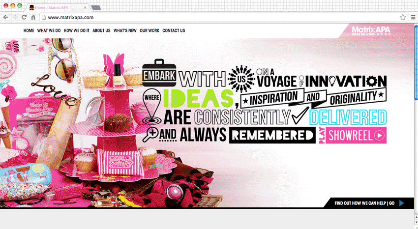
A few months ago, JPC was set with a task to redesign creative product design and procurement partners, Matrix APA’s website. In order to create something future-proof and push our client’s brief to deliver above and beyond, we decided to make this site fluid and responsive, allowing it to always work for their customers in the way they need it to.
How will web design continue to evolve in 2014? Keep an eye out for the next instalment in my web design series where I’ll be update you with the latest and greatest in digital design.