I have recently delved into the early stages of web design for a custom-built, fluid, responsive website for one of our group companies, the charity Brand Amplifier. We’ve recently rebranded them with a fresh identity and the site has just gone live.
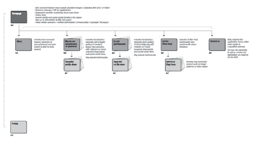
One of the key things I have learned is the importance of planning and process! The web design process is broken down into stages, outlined in a project plan. The first stage in this plan is to layout a site map that consists of a basic structure showing all the pages of the site and how they interact together. It’s essentially a bird’s eye view of where and how the content will be used. It’s really important to share this process with the web developers and the client so everyone is clear on the plan going forward and to ensure all bases are covered. Below is the site map we created at the outset for the Brand Amplifier website:

Next up is the wireframing stage. Wireframes are simple, structural layouts, similar in principle to the blueprints of a house. They show the framework of each individual page within the website, as outlined in the site map, but in more detail to show site navigation, rough sizes and placement of page elements and specific functionality. The exact layout and look of the wireframes isn’t important, they are devoid of colour, fonts, logos and other design elements. The content doesn’t necessarily have to be ready, as long as you know what is coming and where it will sit on the site, so you can base the design around the content, rather than the other way round! Again, this stage is really important to share with the client and the developer, so everyone can agree on the content and overall functionality.
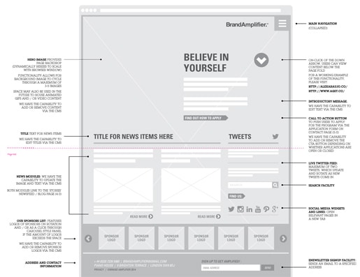
Here’s an example of a wireframe we created for the Brand Amplifier website home page:

As you can see, most of the content is visualised here using placeholders to show the desired layout. Images are represented by boxes and basic elements like social media icons, scroll buttons and search facilities are put in to add some context to the plan. At JPC we have amassed a collection of icons for this specific purpose, that help speed up the process of assembling the wireframes.
The main reason to share these wireframes with all parties involved in the build of a website is to create visibility for everyone and ensure the brief is being delivered upon. They act as a content checklist prior to the design stage that follows, which will of course now be a breeze as everything is, by this stage, already laid out so you can have fun with the look and feel!


