Scrollable websites are the way forward. With the growth of mobile use and smaller screen sizes, it’s all about the scroll! For us at JPC, great design is about putting the user at the heart of the web experience and serving information in a relevant, digestible, inspirational way, however they choose to view it. Our digital gurus bring this through their work and I’ve got it firmly on my radar, so I’ve been doing a lot of research into web trends and these engaging pages keep appearing in my browser. Whether it’s a string of seemingly random facts or a really functional delivery of lots of data, I just love them!
Here are some great examples:
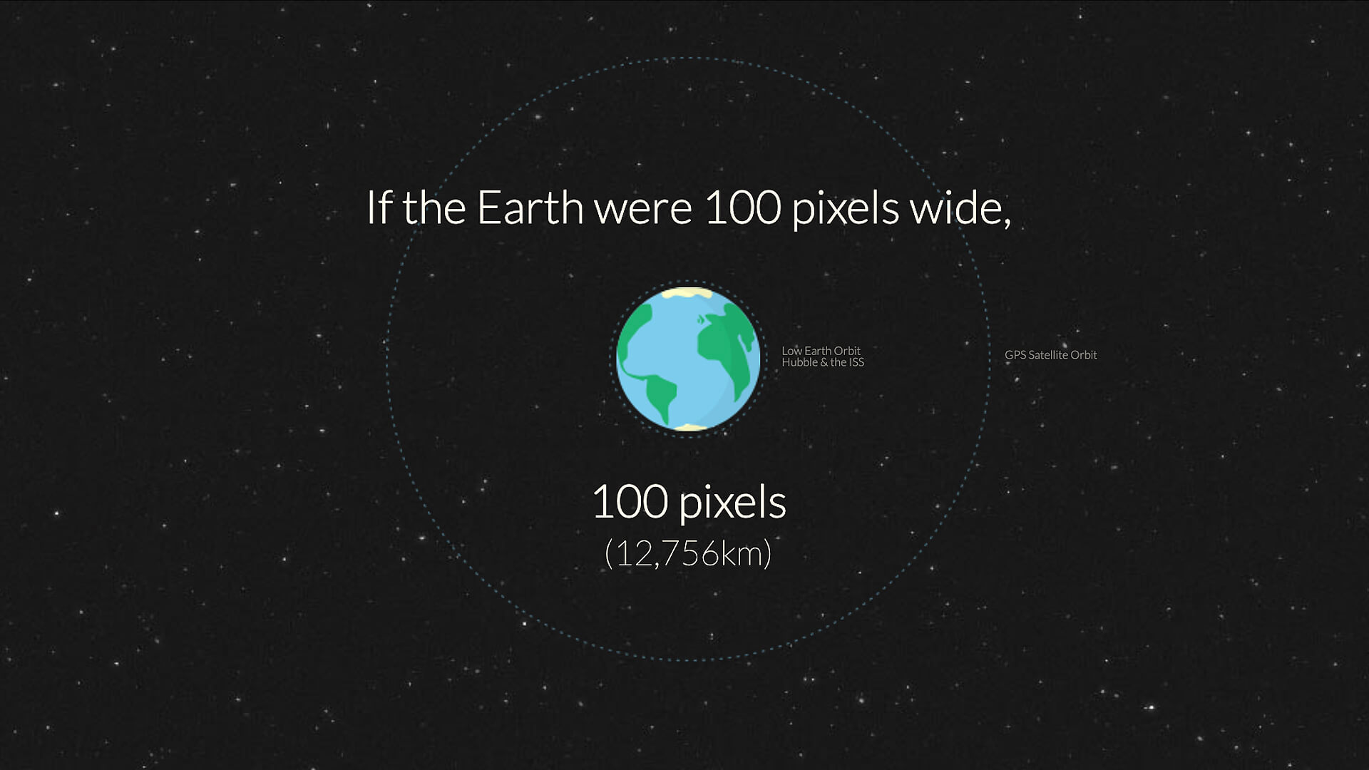
http://www.distancetomars.com/
What better way to visualise this series of space facts on screen? Very simple yet really elegant and quite mind-blowing! Really love its responsiveness and it works on mobile too, although it takes a long time to scroll down to Mars! Brilliant stuff.

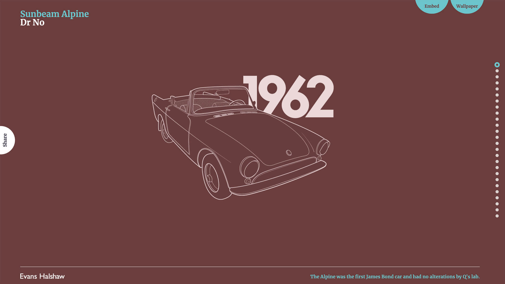
https://www.evanshalshaw.com/bondcars/
This page uses the mouse scroll in quite a different way to flick through an era of Bond car designs. Very fitting for the subject in its sleek design and cool colour palette. I particularly love the attention to detail in the way car parts and the dates slot into place as you scroll, as well as the bold, carefully selected typefaces which fit this medium perfectly.

https://digital.com/blog/successful-mobile-app/
Looking to build a mobile app? Find out how you can turn it into a business with the help of Digital.com’s Ultimate guide to turning an idea into a successful mobile app. This shows the power of taking a strong concept through to web to create a memorable, shareable site that stands out. There’s a lot of information on this site but you don’t feel bombarded. This is a pretty simple design with an infinite scroll action just to emphasise the point!
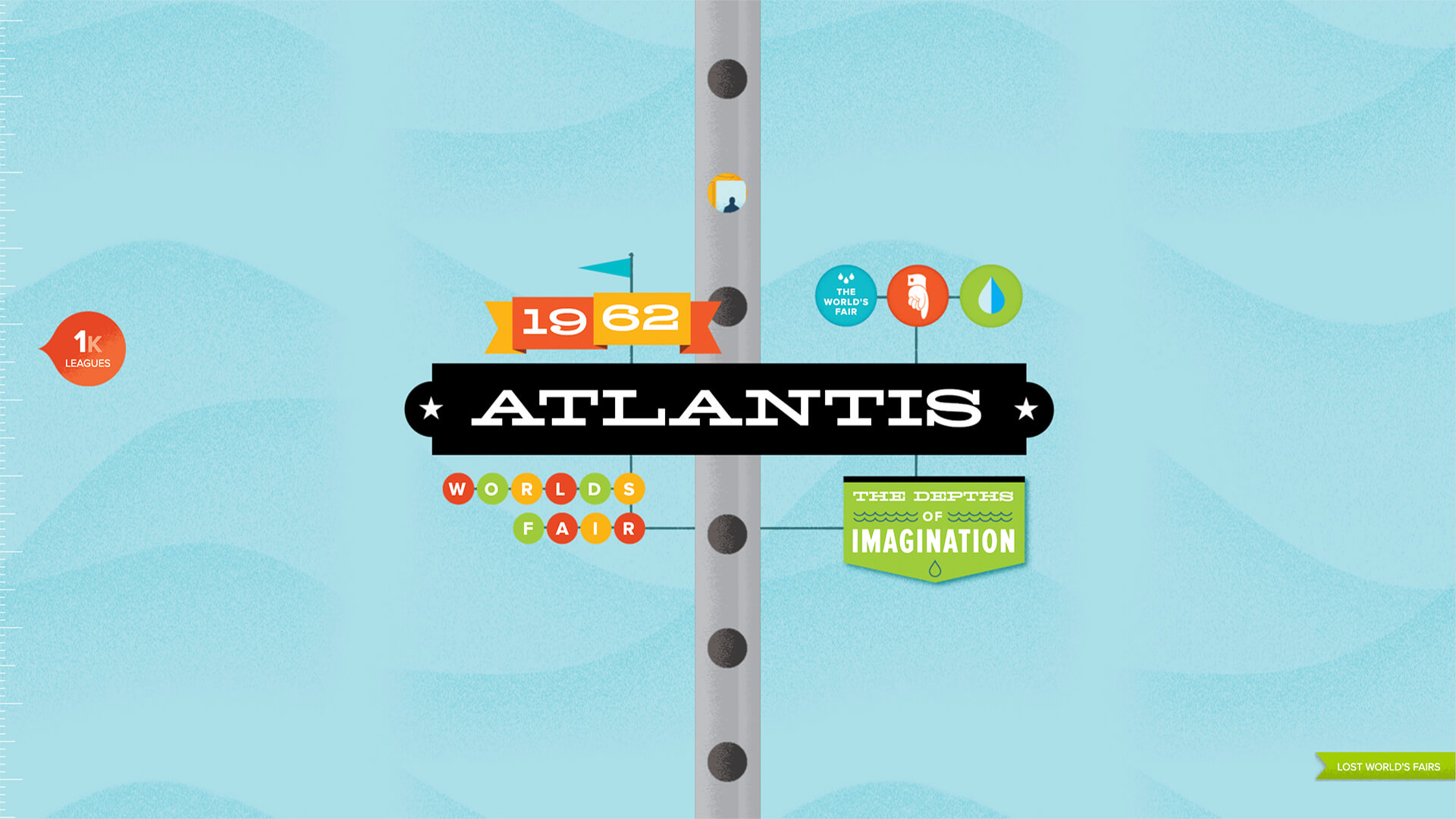
https://lostworldsfairs.com/atlantis/
OK just one more… If you’ve ever wanted to travel to the lost city of Atlantis, then give this a go. You’ll plummet as quickly or as slowly as your mouse will let you, to the ocean floor, passing various facts and figures on your way. This page was designed to celebrate the wonders of The Web Open Font Format (WOFF [LINK: https://en.wikipedia.org/wiki/Web_Open_Font_Format]) and I think it showcases these useable fonts very nicely.

Having discussed these gems with our digital team here at JPC, I have learnt that these effects are achievable with the direct use or a manipulation of a JQuery plugin with the support of HTML 5 APIs. Using these technologies enable us to experience these amazing pages in a really engaging way.
I will continue my voyage into the world of web design as the JPC creative team look back over 2013’s web trends and look on to what’s in store for 2014. We’re already working on some exciting web projects that are perfectly designed for the responsive web era we’re in now. So watch this space!


