They say ‘a picture is worth a thousand words’ and this is true now more than ever. In an age where everything is a click away the average trigger-happy consumer sails through hundreds (thousands?) of pieces of content a day with little being taken in. So how can businesses get customers (or potential ones) to stop and take notice? How do you make your brand stand out? The answer:
Visuals!
Brands can’t shine using dense copy and modern consumers can’t – and won’t — cope. Yasmine Mahmoudieh revealed at Women 2.0 London that 90% of failure in tech companies was due to poor visuals. This shocking statistic is, in reality, unsurprising. The explosion of websites such as Pintrest, Instagram, Snapchat and most recently Jelly illustrate an undeniable shift in popularity from written to pictorial content sharing. 58% of the world is armed with a smartphone, and desktops are fading fast. It’s a mobile world, with fast-moving stories told visually because it’s simple and relevant.
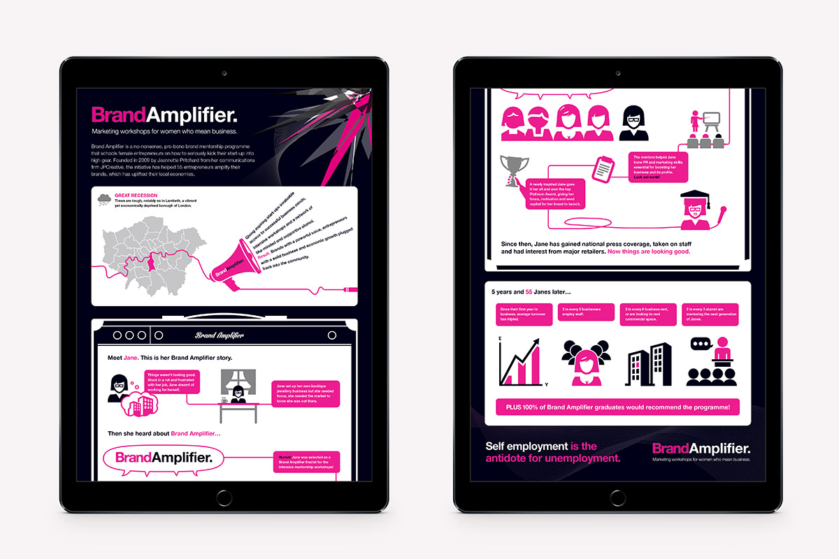
Our studio proved this when tasked to bring a statistical survey of our charitable programme Brand Amplifier to life. The blood sweat and tears of our 4-week intensive boot camp was condensed into a single image. Concise, eye catching and very effective! Information was easier to absorb and our impressive 85% alumni success rate, easier to boast about! This year we secured an unprecedented amount of support from funders, advocates and applicants because we communicated the benefits succinctly and memorably through an infographic.
Bids and Tenders
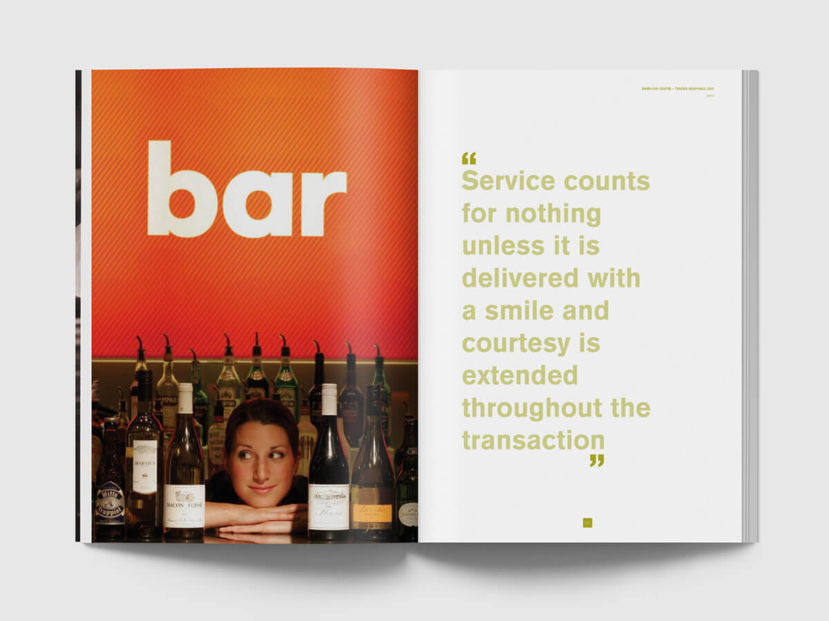
In our earlier years, JPC worked with Searcys to revolutionise their bid and tender process. We transformed them into look books, making these dense and protocol-laden documents shout with confidence, memorability and wow. Design was in the driver seat of this strategic approach. And it worked. Searcys generated £55 million of contracts from just these 3 tenders.

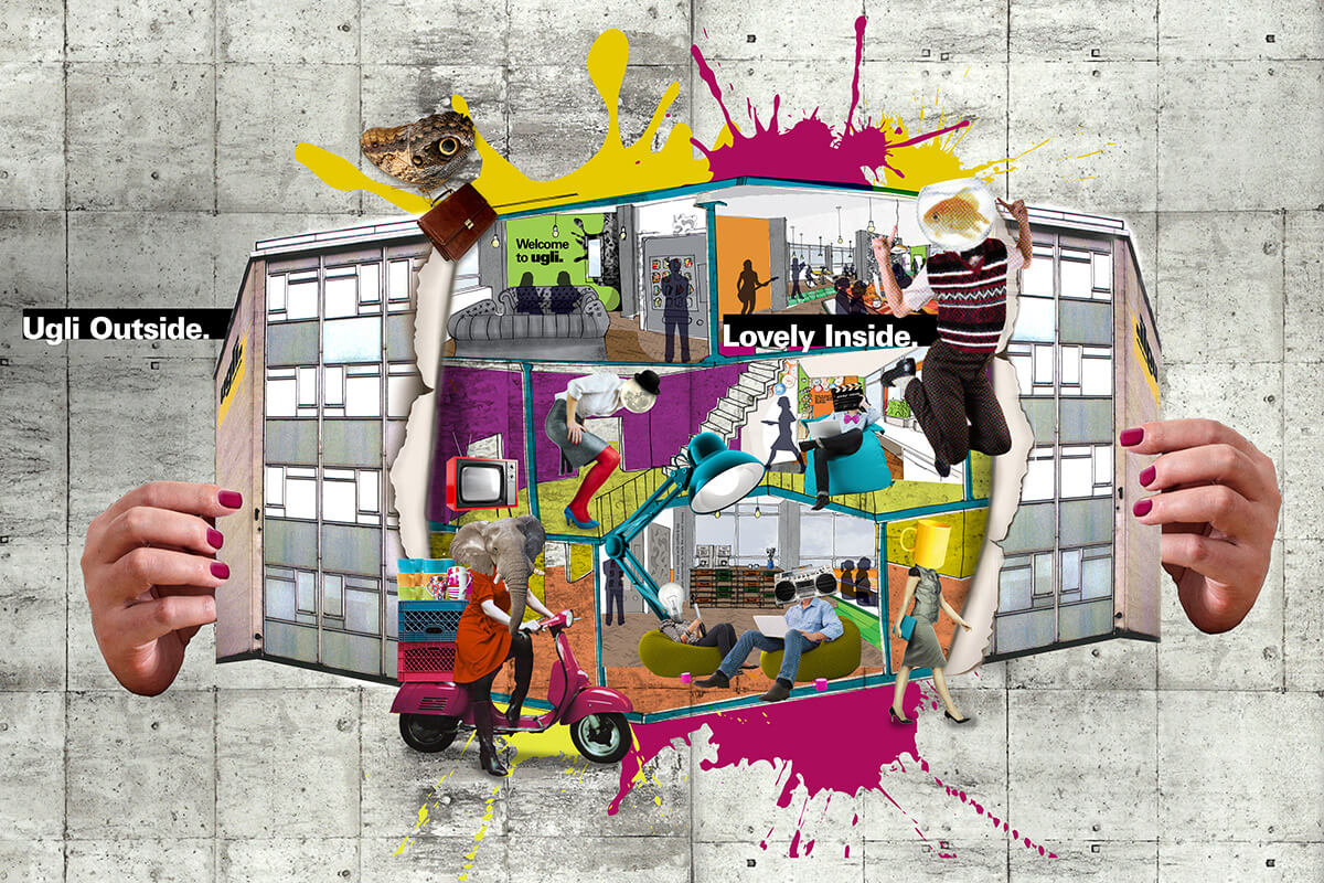
We’ve been saying it for years to our clients, our team, and anyone who will listen. Creativity, well executed, drives commercial performance. That’s why we created the Ugli Campus in White City. It’s undoubtedly no Buckingham Palace, but we turned a liability into an asset. It’s dowdy exterior is its brand strength, and its visual identity captured the hearts and minds of the 700 creative souls that call it home away from home.

A word of wisdom – see how visuals allow you to say more with less text…. Faster. It just might give your brand the edge to get to the customer before your competition.


